
As the UX designer for the PricePoint application, I was responsible for evolving the pricing tool from its MVP stage to a fully realized product. I redesigned the application, and together with a team, we migrated to a new design system called Sapphire that was in line with the company brand. We faced the situation where the old logo used for the MVP wasn't relevant anymore, didn't create the desired look and feel, and didn't support the user experience I wanted to create for users.
Therefore, I conducted research with team members, discussing the qualities it needed to represent, and designed several logo versions ranging from a complete redesign to an evolution of the existing one. After collaborative review, we selected the design that best represented PricePoint's evolution and core values.
Note: In screen examples "Lorem ipsum" placeholder text and fictional values have been used to replace internal information.
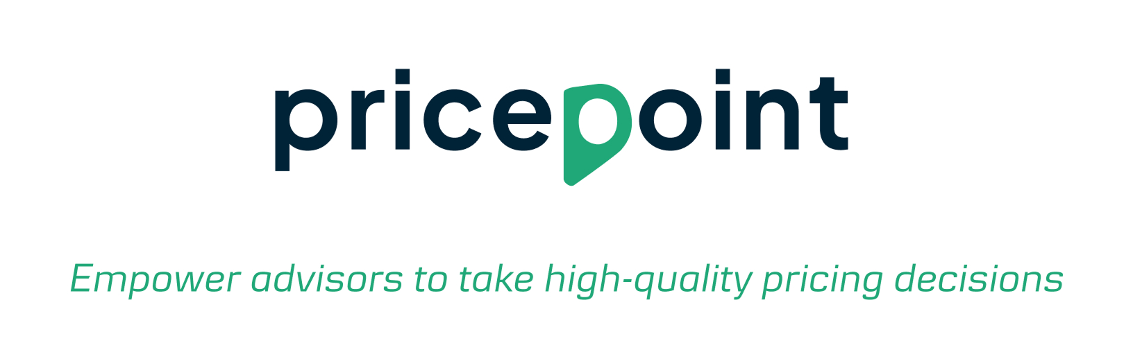
The new logo is similar to the former one. It maintains the location pin shape; however, it has differences in font and color. With these updates, the name of the product can be bigger and easier to read. It looks confident, clean, and straight to the point, while at the same time being simple, friendly, and trustworthy.
The stylized "p," as in the former logo version, represents the map point, a clear destination and the result of the product calculation that is part of the product name and, at the same time, an inherent quality of the PricePoint project.
The main characteristic of the PricePoint project is trust. It should be related to finances and something you can rely on. Furthermore, it should be accurate, warm, human-friendly, confident, and a true tool helping advisors in their everyday work.
These qualities are closely related to the PricePoint mission: Empower advisors to take consistent and high-quality pricing decisions by making customer profitability insights actionable.
In addition, the tool and its logo should be cool not just for users, but also for squad members to work on. A modern, simple, and clear look will create additional clarity for its users and be in line with the Sapphire design system. The new logo is not a radical change. It uses some elements from the current logo and some Sapphire elements.
Green color is associated with results, as this color shows the final calculation provided by the system. The green color is associated with health, calmness, positive action, energy, motivation, and optimism. It's popular in IT, finance, and banking.
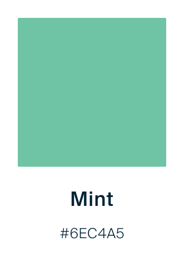
Mint green is associated with tranquility, health, good looks, freshness, and creativity. In some sources, it is noted that it can signify growth, wellness, and fertility.
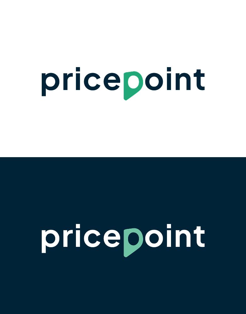
The logo icon color for a dark background is Green 400; for a white background, it is Green 450, in order to provide enough contrast between the logo and its background.

Does my work resonate with you? Want to find out more? Send me a message describing your project here.


